Aspect – 18 Styles Font Family by JeremyTankard
Aspect – 18 Styles Font Family
18 Fonts | OTF | +Previews | PDF | JeremyTankard SALE PAGE $270
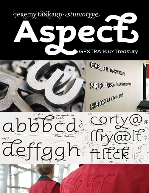
- Designed as a vertical script, this type offers huge flexibility. It has a wide proportion and a flowing structure. A massive range of swashes and ligatures are included to embellish any typographic design. Fonts are now intelligent. Aspect was designed to test and push this advancement in typographic technology offered by the OpenType format. Started in 2001, Aspect was a commission for the new Christchurch Art Gallery in New Zealand. The brief offered full creative freedom, which is usually more of an Achilles’ heel than a benefit. Having said that, the freedom given allowed for the concept of a typeface being ‘a tool to design with’ to be explored more fully. Initial thoughts leaned toward the idea of an italic script because, using this model, letter shapes could be more easily extended in exotic ways.
- The many unusual and unique shapes all add to its distinctive appearance. Yet, Aspect can still be used in a more traditional manner by setting text with only the standard characters and basic ‘unadorned’ ligatures. Customisation of a word might be limited to the considered use of a single special character such as an alternate or swash, or the word could take on the flamboyance of an elaborately ligatured swash. Originally released in 3 weights, several years later Aspect was expanded with an ExtraBold and Heavy.
The concept behind Aspect was to produce an upright script
typeface. Understanding of the term script varies. It can
refer to an individual writing style of
any kind, writing informed by a cursive or flowing
construction and especially as practised by the writing
master, or the informal brush script of the
commercial lettering artist. To take even the most specific
idea of a script – as a series of letter or typeforms
following a flowing construction – is then
further riddled with difficulty. When does a calligraphic
form become a typographic form?
Aspect sketchbook
The process of translating written forms into the
typographic medium is not as straighforwardly imitative as
it might seem. The first so-called italic
typeface was produced in 1501 in Italy. Cut by Francesco
Griffo for the printer/publisher Aldus Manutius and based
on the writing of the humanist scribes, it
was intended as an independent text face for pocket-sized
books. Yet, over time as typographic tastes changed, italic
types came to be used in an
increasingly auxiliary role to that of roman text types.
Eventually italics were to lose many of their written
features and made to formally harmonize with
roman styles.
To preserve the sense of the calligraphic within this
typeface Aspect introduces many alternate character forms
reflecting the formal diversity of writing.
In fact the freedom of approach adopted during the early
design stages of Aspect has resulted in some intriguing
character variations and combinations with
well over 200 single and ligatured forms on offer.
Ligature development
These many unusual and unique forms all add to the
distinctive appearance of Aspect. Yet, Aspect can still be
used in a more traditional manner by setting
text with only the standard character forms and the basic
ligatures such as fi and fl. Or customization of a text
might be limited to the considered use of a
single special character. From simple finial forms and
swashes through to incredibly elaborate ligatured swashes,
Aspect certainly offers huge flexibility
and if you should choose to pursue a more exotic design
path, it is clear to see the many creative possibilities
readily available.